The user interface (UI) appearance of Cleanfeed is one of the most established pieces of our service, so it’s time to carefully give it a refresh and a new look for 2025!
Users of software often raise an eyebrow at change, and we know they’ve been burned before. We spoke with a broad set of users (power and novice) who were, naturally, concerned that any kind of changes could break their favourite parts of Cleanfeed; the nuances that make it so suitable for their particular use.
Often, rewrites of user interfaces lose the years of institutional knowledge and refinement that made the early version good. For a high profile case, look at the recent software changes at Sonos.
But also it was clear that a Cleanfeed refresh was desirable. The old aesthetic didn’t have the necessary appeal to attract new people who hadn’t heard of us. Practically it was dated as well; it was designed for PC and laptop displays of a size that are probably around 50% of the size of today’s modern ones.
So we wanted a refresh things, but ruled out the huge overhauls (typically “version 2”) that software companies have a tendency to make.
The Sonos story tells a common outcome that, behind the scenes, the motivation may not be as it seems. Rewrites like this appear to customers in the form of a new aesthetic or features, but are often not driven by this at all.
Sonos gave their reasoning as the ageing of software languages, toolkits or frameworks that triggered the need for rewrites — modernisation to the aesthetic and changes to user interaction come partly as a side effect of a fresh start on completely new tools. Used judiciously that has the potential to improve everything all at once, however it takes a lot of discipline in a fresh start to retain all the institutional knowledge, and just as we’ve seen with other companies the results are famously hit or miss.
At Cleanfeed we take a deeper control over our software tooling and modularity than other companies might choose to do. There are some big advantages. Maintaining our own framework for build toolking and user interface in a conservative way isolates us from a lot of churn to the surrounding ecosystem or short-lived trends that can build up technical debt at a rapid pace. We keep a well maintained codebase and make changes when we want to, where we want to.
This advantage of avoiding fallout like this is particularly important for the the cutting-edge parts of Cleanfeed buried deep in its audio system. (There are disadvantages, of course, and we still have to keep technical debt at bay; one for another blog post, perhaps.)
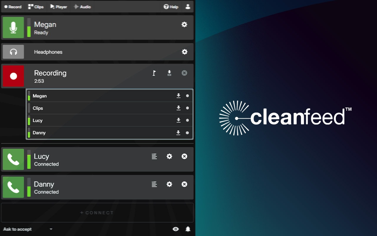
So our recent refresh is focused on aesthetics and interaction only, and the most significant changes are:
- A new rounded aesthetic and ‘electric’ colour scheme
- Larger: better for modern screens, greater clarity and higher resolution. If you preferred the old size (perhaps to sit Cleanfeed side-by-side something else) then set your browsers “zoom” control to 80-90%.
- More visual indicators of stereo vs mono (microphone) audio.
- Greater availabilty of drag-and-drop to reorder items (in Cleanfeed Pro)
- Accessibility improvements: increased contrast, and more focused guidance for screen readers
Early versions of Cleanfeed (some years ago now) were far too low-contrast, making it difficult to read for some people. We quietly dialled in this contrast over time, but this refresh we chose some break-away changes to really establish a high contrast display whether you’re in an office or darkened live/studio environment.
Some things we’ve preserved:
- Most things are still in the same place
- No new or significant drain on resources
For those who may rely on a screen reader, be sure your screen reader (such as JAWS in “web verbosity” settings) is configured to interpret the “regions” in Cleanfeed for accessibility. You’ll find an interface which is logically structured by your local resources, and individual guests. Supplementary screens now present ARIA menus for navigation, which hopefully makes things clearer. The most major change in this release is that you might have to use the settings buttons to reveal additional controls.
The devil is in the details, not all changes are mentioned here and some people will appreciate some of the more subtle ones.
We hope you’ll enjoy the new aesthetic, whilst feeling right at home to get your work done straight away. Feedback is always welcome, so if you have suggestion for an improvement that we haven’t thought about then these aren’t ruled out either; let us know!