“The blog posts are better when you write about a challenge” is what one of our Cleanfeed users told me recently. So, with that in my mind, here’s the story behind a few modifications that never made it into the wild, and some that did.
Recently we made a few minor modifications to the screen seen by Cleanfeed guests; that’s not an interesting topic in itself, and the resulting changes appear to be simple on the surface. But the process is more interesting.
Part of software R&D (research and development) is that you have to retain the option to throw things away if they’re not working out. With modern agile development, a steady stream of progress gets you to an overall goal. But a common problem with that type of persuit is that it’s too easy to forget to look back and realise that something just flat out isn’t working.
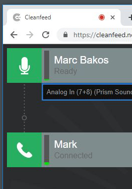
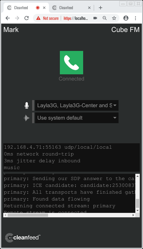
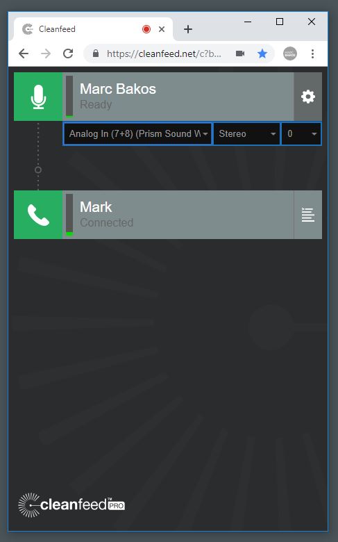
When you ‘Connect’ from a Cleanfeed studio the process is relatively simple already: the person receives an email, clicks on it and, after confirming they’re willing to participate in live audio, they get to a screen which looks like a simplified version of our studio screen.
Up for a potential improvement was:
- Unlike the studio, settings weren’t remembered
- There’s no explicit control over the audio playback device, only capture
- Was it possitible to make the screen look simpler or less intimidating; some users even liked the idea it should be more like a phonecall.
Mockups
We started with mockups: rough designs for a simplified screen; one that would emphasise the single-link nature of your connection to the studio. Vector graphis and HTML mockups were combined to see if we could clarify the experience of the guest.
Some code changes were necessary on the way. We liked the idea that it should be possible to summarise the overall status in a single icon or indicator; instead of the two separate ones for the local and remote party. Turns out structurally that isn’t how the Cleanfeed code works at all, so a little bit of groundwork was needed to the code internals and these took place in parallel. The guest screen borrows much of its code from the studio, where multiple guests and multiple local devices are possible (though not exposed as functionality to guests.)
As the changes evolved we continued to test them, trying them on a few alpha testers. But this process was short lived; we could see ourselves the changes did not lead to a better overall result, even though each change individually had merit.
For example, a side effect was that the new screen was confusing; instead of audio meters being associated with the local and remote parties, they were now associated with recording and playback devices. This is partly because of the use of a single status indicator/icon; that worked well on its own, but results in other UI components becoming ‘orphaned’. What makes sense to the computer code isn’t necessarily make for a good experience by a co-host or presenter.
Over to you
So, after all that we backtracked on many of the visual and layout changes; it was important to recognise the things people liked about the current system. The changes had as much a negative impact as a positive one. About the only visual change is the addition of a line to emphasise the point-to-point nature of the link.
However, many of the core technical changes were incorporated:
- The guest can now control their volume, and left/right mix. The studio retains remote control over these; they are dual-controlled.
- The name of the guest’s audio device is sent back to the studio. They can’t change it, but it helps to stop problems. Previously we had privacy concerns about this, but feedback from users was that it was useful; and were not at all bothered by sharing the make and model of their audio interface, or which channel they are plugged in to.
- All settings are now remembered at the guest side; and associated with the device rather than the email address or Cleanfeed account. This means if you have eg. a desktop and a laptop they can each have different settings.
- Bonus feature: you get a nice ‘Pro’ interface if you’re participating in a studio session that is subscribed to Cleanfeed Pro.
We still think there’s potentail to improve the guest’s screen, but our next experiments are likely to be more faithful to the aspects we have learned to be good about the current UI.
Have any thoughts on how you feel the process for guests should be? We’re always interested in your feedback via email. Please do let us know your thoughts and how it affects you when you’re using Cleanfeed!